Some ideas are genuinely worth getting excited about.
A 3D learning world built specifically for middle schoolers, where students in grades 7 through 9 could step inside their lessons, explore immersive environments, and actually engage with the material instead of just reading about it. Where a history lesson could put you in the middle of a medieval battle, and a physics concept could play out in a world you were walking through. Where education stopped being something that happened to you and started being something you participated in. That was the vision. And it was a strong one.
The team had already made real progress in building it. A talented group of 3D artists and developers was deep inside Unreal Engine, constructing worlds that genuinely felt alive. The environments were detailed, the activities were creative, and the foundation for something special was already in place.
What the project needed was a unified design layer to bring it all together.
The web portal where parents tracked their children's progress, the student dashboard where kids managed their collections and courses, the admin tools educators relied on to build and distribute lessons, and the in-game interfaces living inside those Unreal Engine worlds were all operating in their own visual language. Each piece was functional on its own. But together they didn't yet feel like one cohesive product.
My goal was to build the connective tissue across the entire ecosystem. Starting from brand discovery, I developed the visual identity, color system, and design language that would become the common thread running through every surface. From there, I worked closely with the 3D team to ensure the branding translated faithfully into the game, directing the visual placement of UI elements within the environments and helping bridge the gap between what appeared on screen in a browser and what needed to work in a first-person 3D world.
The goal wasn't to reinvent what was already working. It was to give every part of the experience, web, game, onboarding, analytics, collectibles, activities, a shared visual identity and interaction logic so that a student moving between their parent's dashboard and the game world felt like they were inside the same product the whole time.
Understanding the Problem at Its Roots
Before opening Figma, I needed to understand what was actually broken and for whom.
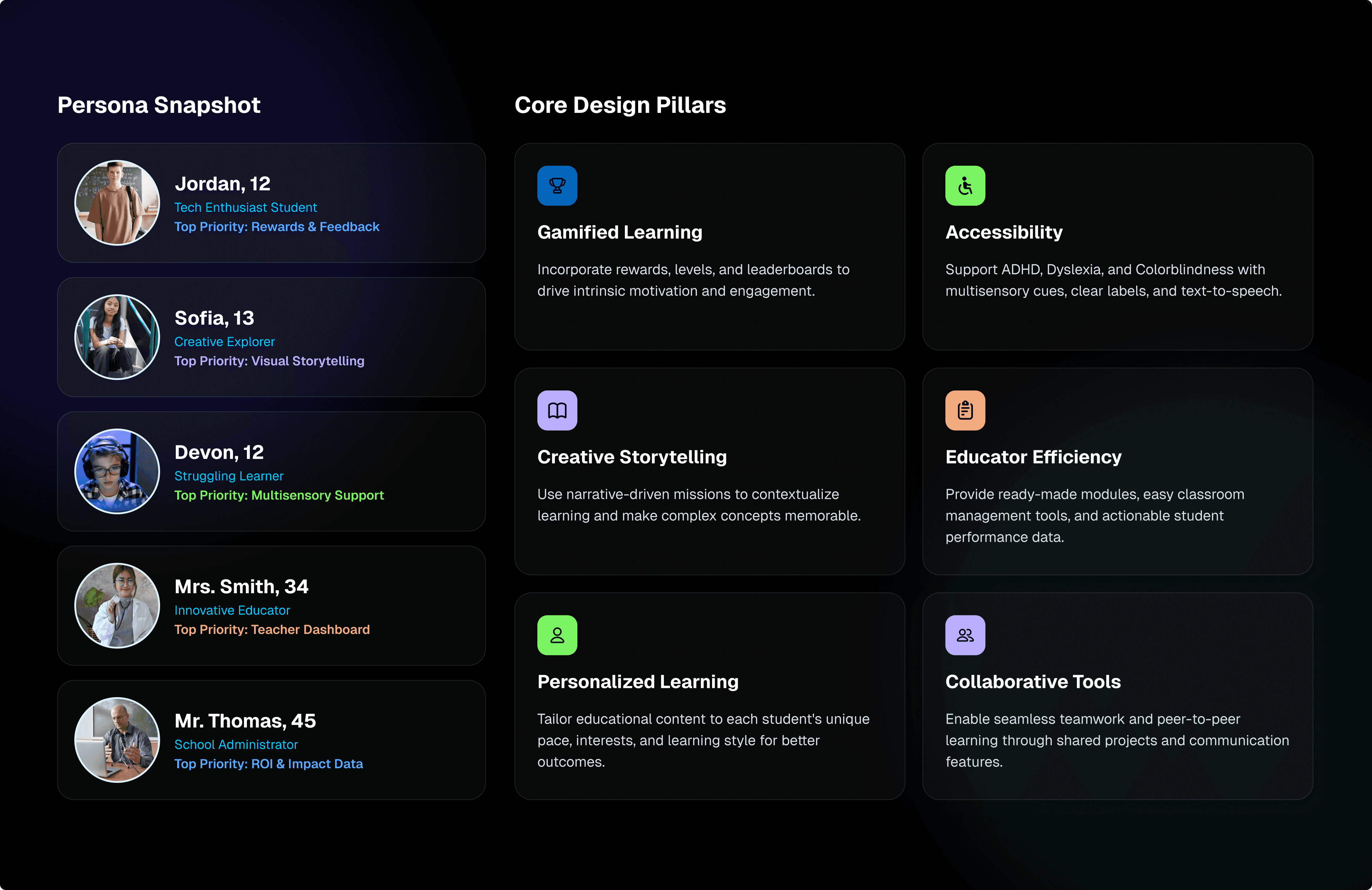
The platform was trying to serve four completely different types of users at once: students, parents, teachers, and administrators. Each group had different goals, different comfort levels with technology, and a different relationship with the product. And none of them had an experience that felt built specifically for them.
Students between the ages of 12 and 15 were entering a 3D game world with almost no onboarding scaffolding. No compass. No clear sense of progress. No feedback loop that gave them a reason to come back the next day. The gamified learning environment didn't feel like a game.
Parents were expected to top up their child's account and keep tabs on learning progress through a dashboard that offered minimal useful information and zero emotional reassurance that their investment was going anywhere worthwhile.
Teachers and educators had to build structured curricula and track performance across entire classes using tools that weren't built for speed or confidence. Creating a lesson felt like filling in a government form.
Administrators were managing users, groups, and institutional licenses without a high-level view that made the scale feel manageable.
And running under all of it was the biggest problem of all: there was no unified visual language anywhere. The marketing website, the web portal, and the game environment felt like three separate products from three entirely different companies. Nothing connected them.
Building a Brand From Scratch
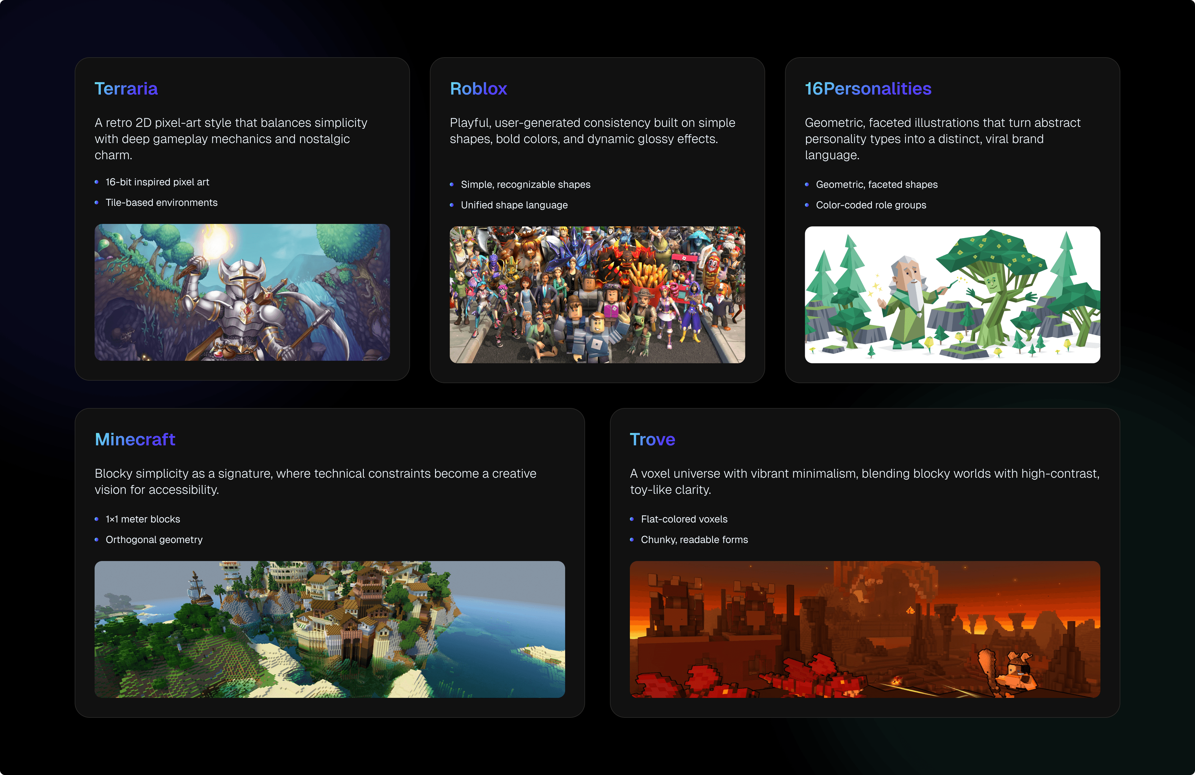
The first move was to go wide before going deep.
A full competitive landscape review across gaming platforms like Roblox, Minecraft, Terraria, and Trove, and across the educational technology space, helped define where the real design opportunity lived.
Most EdTech platforms talk down to kids. They were either too corporate and sterile, or so chaotic they felt overwhelming. Most gaming platforms went all-in on spectacle but carried zero educational credibility. The space in between, something that was visually bold and emotionally trustworthy at the same time, was wide open. Nobody was standing in it.
Out of that research came two brand archetypes that became the strategic backbone of everything that followed.
The Explorer: curious, driven by discovery, always looking for what's around the next corner.
The Sage: structured, knowledgeable, quietly confident in what they know.
Together, they defined the platform's promise: you don't just play here, you get smarter here. Every single design decision after that was filtered through that lens, from color choices to how copy was written to how activities were structured within the game.
The Visual Identity
The color system had a very specific job. It needed to feel electric enough to excite a 13-year-old and credible enough to sit comfortably in a school board presentation.
Cyan Blue (#00D0FF): primary, energetic, forward-looking
Midnight Navy (#002B3D): depth, focus, high contrast
Sunset Orange (#FF6F3C): warmth, reward, momentum
Aurora Green (#3ED598): success, progress, achievement
Neutrals: Light Silver and Charcoal for breathing room and legibility
Typography combined Geist for display, which is geometric, modern, and self-assured, with Inter for UI body copy. This kept everything readable at small sizes across both web interfaces and 3D game overlays.
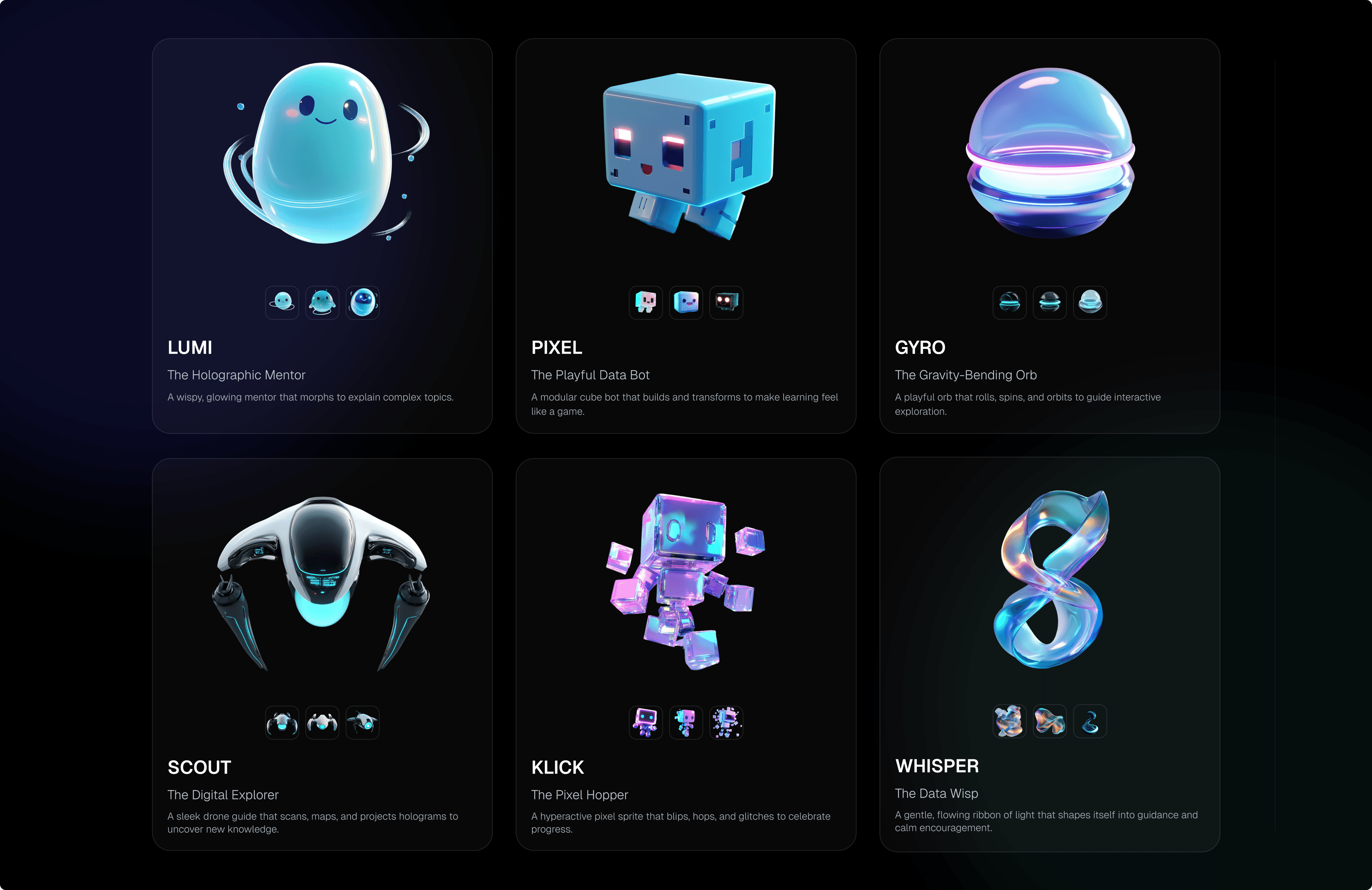
Designing the AI Companion Characters
One of the most distinct and genuinely fun parts of the brand work was developing the AI assistant mascot concepts.
These characters were going to live inside the game world, guiding students through lessons, nudging them toward answers, and making the whole environment feel inhabited rather than empty. They needed to feel approachable without being childish, a little quirky without being distracting, and visually coherent with the world they'd be living inside.
Six characters were developed and presented to the team.
LUMI: The Holographic AI Mentor
PIXEL: The Playful Data Bot
KLICK: The Pixel Hopper
GYRO: The Gravity-Bending Orb
SCOUT: The Digital Explorer
WHISPER: The Data Wisp
Each one had a distinct visual identity, a defined personality, and a specific role in the student's learning experience. They weren't mascots for the sake of mascots. They were the emotional center of what the student experience could feel like, the friendly presence that turned a confusing moment into something that felt guided and safe.
The Design System, One Language Across Two Worlds
This was the part of the project that I found most technically satisfying and most important to get right. Every component, every color token, and every interaction pattern had to pass the same test: can this translate into Unreal Engine without losing what makes it work? That meant avoiding shadow styles that fall apart under dynamic 3D lighting. It meant choosing contrast ratios that hold up against richly rendered environments that shift with every step the player takes. It meant building button states, icon systems, and overlay panels that the Unreal development team could implement faithfully without having to guess at the design's intent.
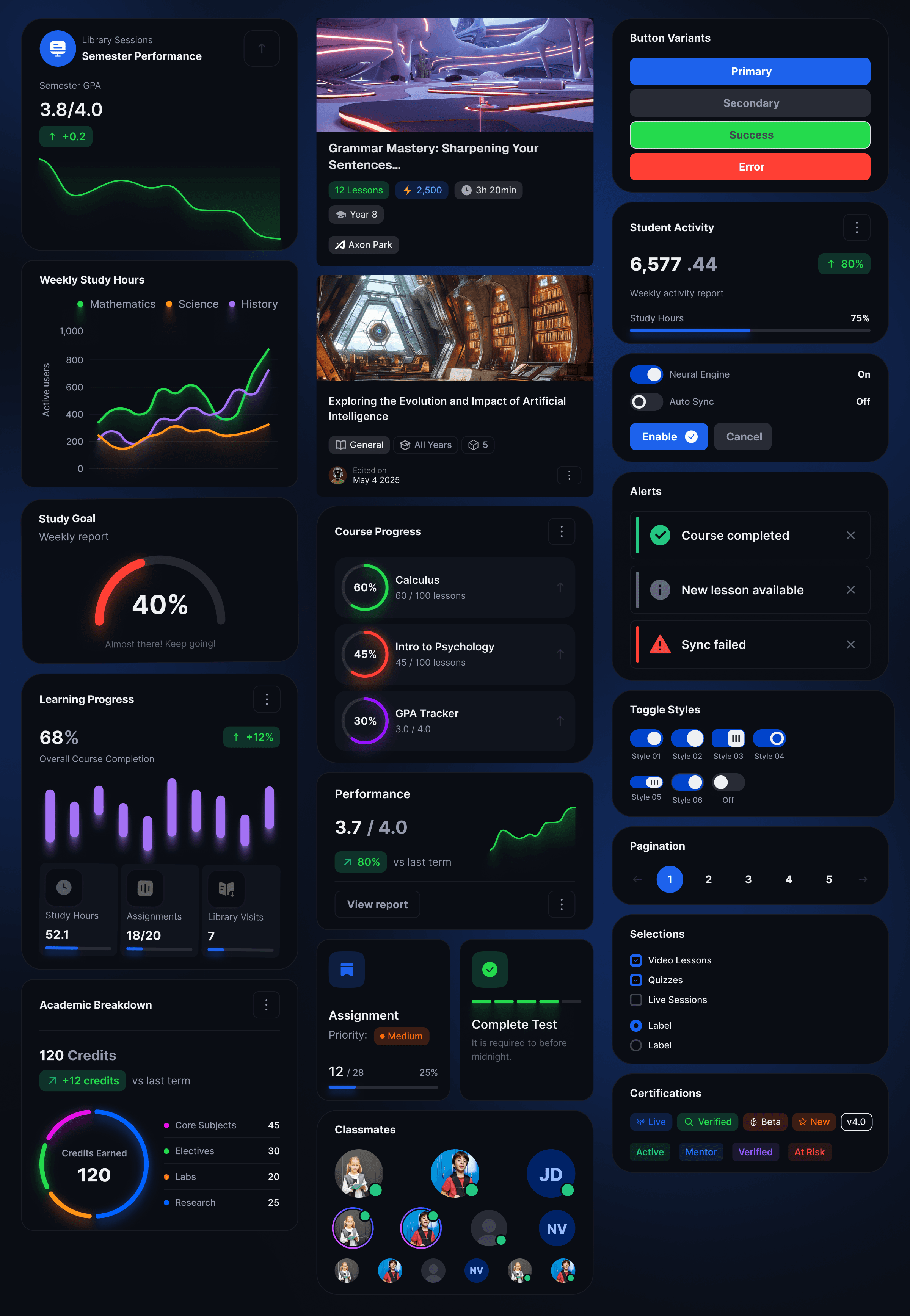
The component library that emerged from this process was extensive. Navigation systems covered sidebar menus, tab bars, and in-game HUD panels. Cards and content panels handled course listings, collectible items, and activity previews. Activity interfaces addressed quiz overlays, answer selection states, progress indicators, and countdown timers. Data visualization components handled progress rings, performance trend charts, weekly study-hour breakdowns, and domain-level performance breakdowns.
Everything was built in Figma with careful naming conventions, auto-layout systems, and thorough documentation of component variants. Once it was done, the whole system was packaged into a brand and design system book that every team member could reference, including the 3D environment artists working inside Unreal.
The Web Portal, One Platform for Every Role
The web portal serves four different types of users under one roof: students, parents, educators, and administrators. Each role gets its own tailored view, all built from the same design system, all feeling like the same product.
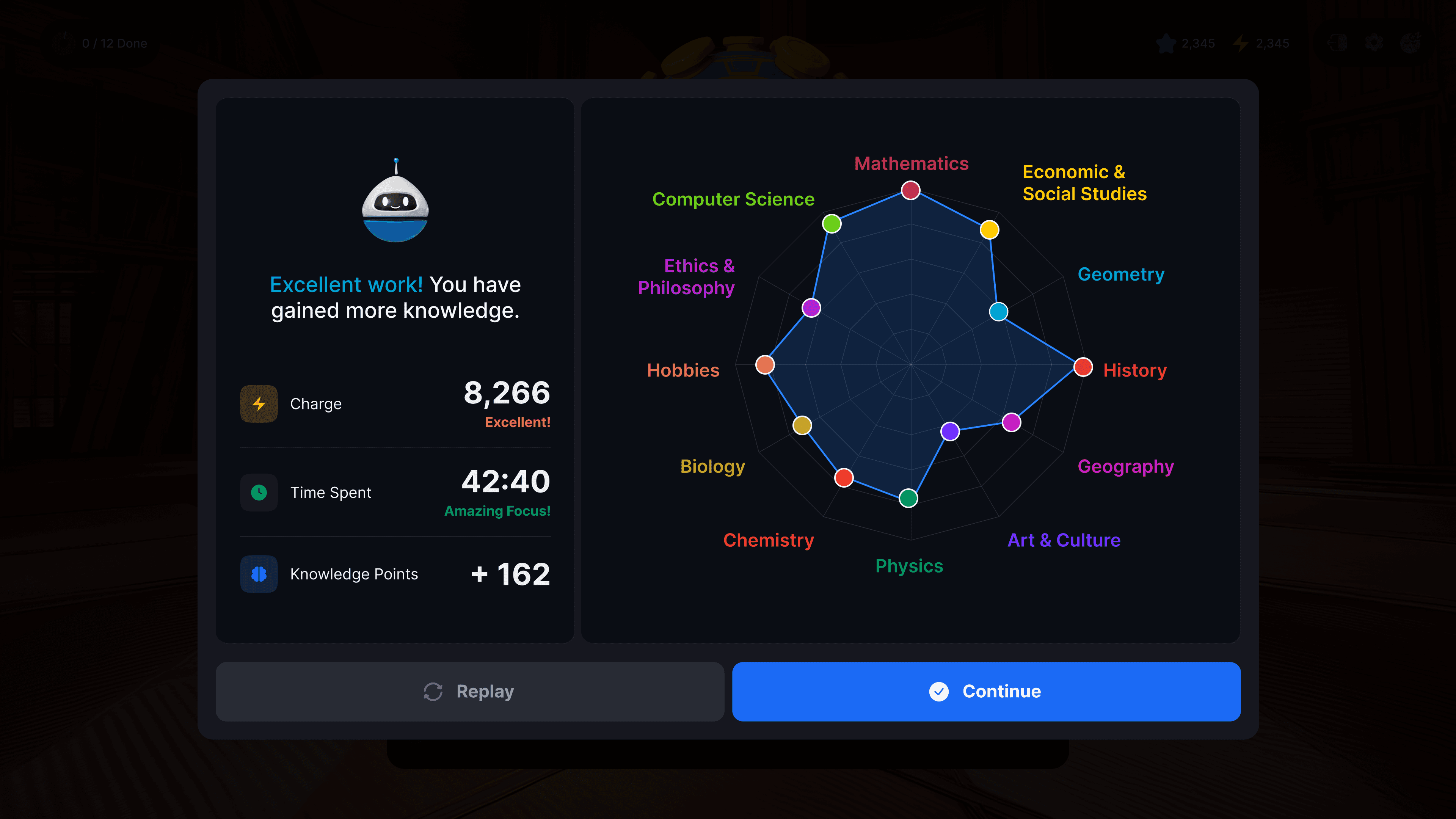
Students get a personal home base showing their Charge balance, learning hours, equipped cosmetics, and collectible inventory. The Analytics view surfaces completion rates, Knowledge Points trends, and subject-domain performance, so they always know where they stand and where to focus next.
Parents get an at-a-glance view of every enrolled child with performance summaries, learning time, and completed courses. One tap opens a full breakdown of lesson-level progress and KP progression over time. The collectibles panel doubles as a progress narrative: when a parent sees their child's Golden Pinata equipped, they know it was earned.
Educators work through a guided lesson-creation wizard that takes them from selecting source material all the way to assigning a virtual world environment, with learning outcomes filtered by the Knowledge, Application, and Critical Thinking taxonomy levels. The course library gives full control over access, down to individual lesson packs and specific student groups.
Administrators get a true platform-wide view. Daily and weekly active users, lesson completion rates, average session time, purchase conversion, KP progress trends, domain performance charts, and ranked lesson tables showing what's working and what needs attention, all filterable across multiple time ranges.
The Lesson Creation Flow: An Educator's Toolset
Building a lesson on this platform is a multi-step process, and it needs to feel guided without feeling bureaucratic. The lesson creation wizard was designed as a six- to eight-step flow, with each phase clearly marked and a persistent progress indicator running throughout.
Educators start by selecting source material from a content library. They configure lesson parameters, including year group, duration, and target language. They choose learning outcomes and filter them by Knowledge, Application, or Critical Thinking taxonomy levels. They pick a teaching methodology template, assign a virtual world environment, and can optionally let the AI scaffold the lesson structure.
The UI was intentional at every step: a consistent sidebar that shows all phases, clear forward-and-back navigation, inline help text, and real-time feedback on selected objectives. First-time curriculum builders could move through it without needing to ask for help.
Courses and Lessons Library
The Organization overview surfaces Active Users, Total Users, and Inactive Users with week-over-week trend indicators, then lists every learner and educator with role tags, session counts, course assignments, group memberships, and account status. It's a lot of information, but organized in a way that makes sense when you need to find something specific.
The course library supports both grid and list views with filtering by year group, subject, and status. Course detail modals let admins control access lesson by lesson: assign to specific student groups, toggle school-wide versus group-level access, and manage lesson packs inline without ever leaving the course view.
Inside the Game, Designing for 3D Space
This is where the project became something I hadn't quite done before, and honestly, the part I found most rewarding to figure out.
Designing a UI system for a first-person 3D environment in Unreal Engine is a fundamentally different challenge from designing for a screen. Every interface element competes with a dynamic, richly rendered world behind it. The UI can't take over the experience, but it has to be instantly readable, contextually aware, and visually consistent with the same system living on the web.
Working directly with the talented 3D team, who were already producing extraordinary environments, the focus was on directing where and how UI elements lived in that space. Not just designing the components themselves, but making sure they sat comfortably inside the world without breaking immersion or fighting with the environment's own visual depth.
The HUD: Persistent Context Without the Interruption
The Heads-Up Display is the student's constant companion throughout the learning world. In the top-left: lesson progress, current Charge earnings, and Knowledge Points. Top-right: settings, character profile, and quick access to the AI companion. Centered at the top: the spatial compass showing cardinal direction and distance to the nearest activity marker.
The Activities: Where Gamified Learning Actually Lives
Standard quiz interfaces are forgettable. Multiple choice. Neutral background. Submit. Correct or wrong. Next. No tension, no play, no real reason to open the app again tomorrow.
Every activity type here was redesigned as its own distinct game mechanic. The same design system runs underneath all of them, but the interaction layer on top is completely different each time.
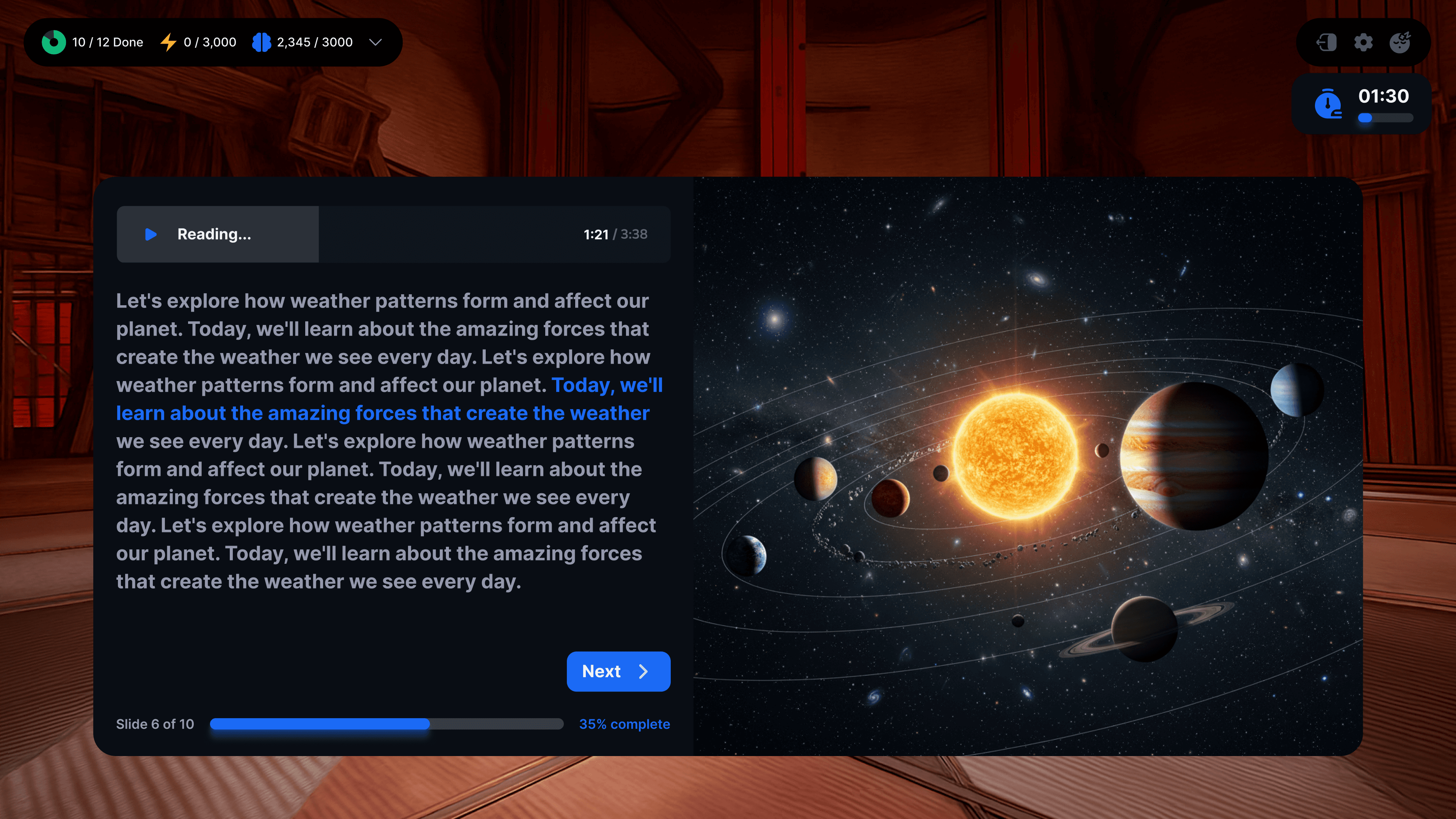
Interactive Quiz. For more visually supported subjects, a media-forward overlay appears with a full-spread contextual image beside the question and four clean answer options. The 3D world stays visible behind it. It feels like learning, just nothing like a classroom.
Pop the Balloon. A math prompt appears at the top of the screen. Dozens of colorful balloons float in a bright, open sky, each carrying a different equation. The student aims a toy cannon at the balloon with the right answer. Miss, and time ticks down. Hit, and the balloon bursts in color. The UI layer is almost invisible: a slim HUD strip, a timer, shot count, and accuracy. Everything else is play.
Glitterball Squad. The student directs a ball toward answer options distributed around the 3D environment. Same curriculum content, completely different interaction model.
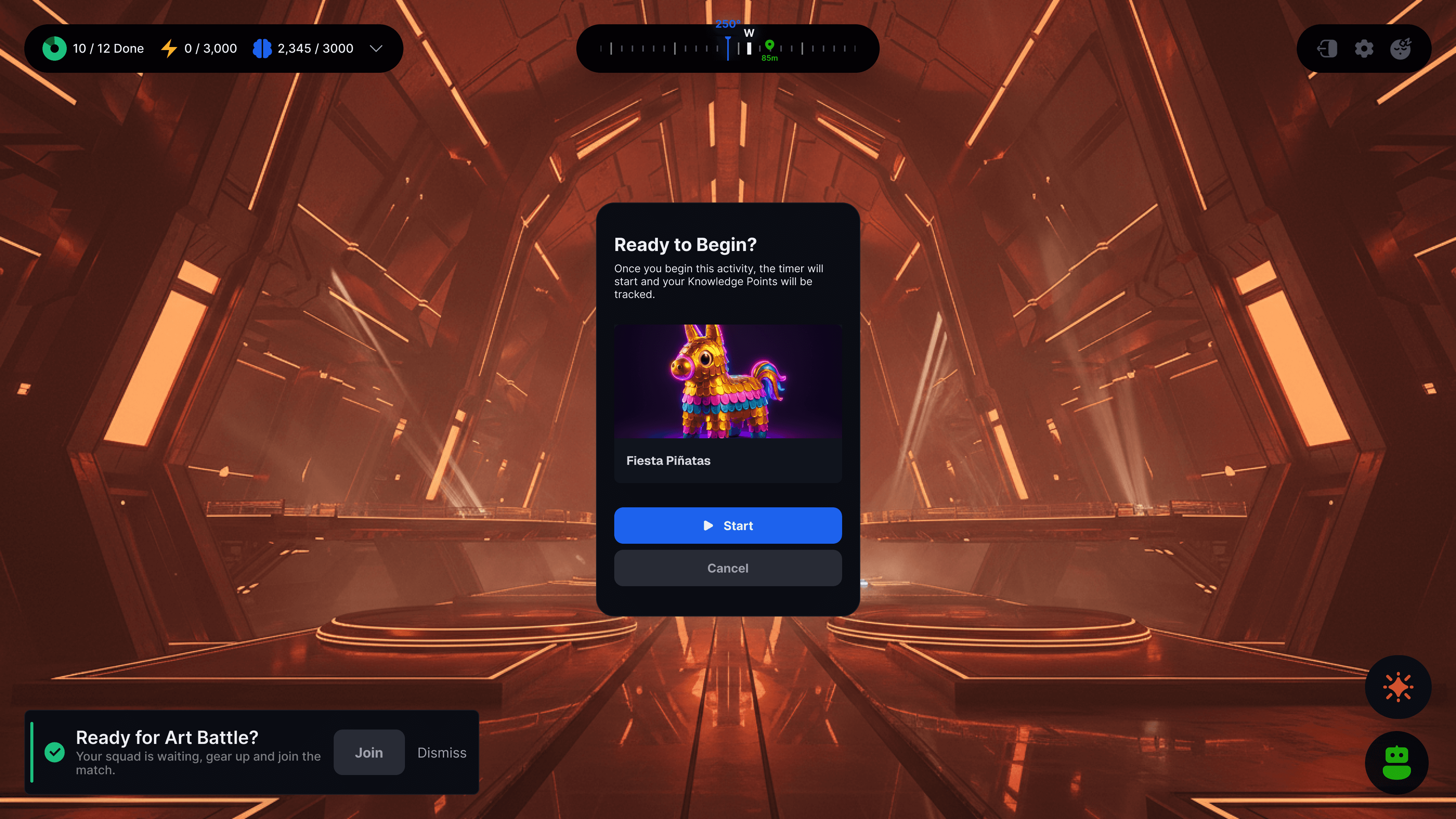
Fiesta Piñata. Four piñatas stand in the 3D environment on glowing platforms, each labeled with a possible answer. The student swings their bat, which might be the Neon Lightning Bat or the Crystal Power Bat, depending on what they've earned, at the correct one. The question is spatial. The answer is physical. The reward is immediate.
Each activity shared the same underlying visual system, with consistent HUD positioning, timer components, and progress bar structure. But the mechanics made every lesson feel like a genuinely distinct experience.
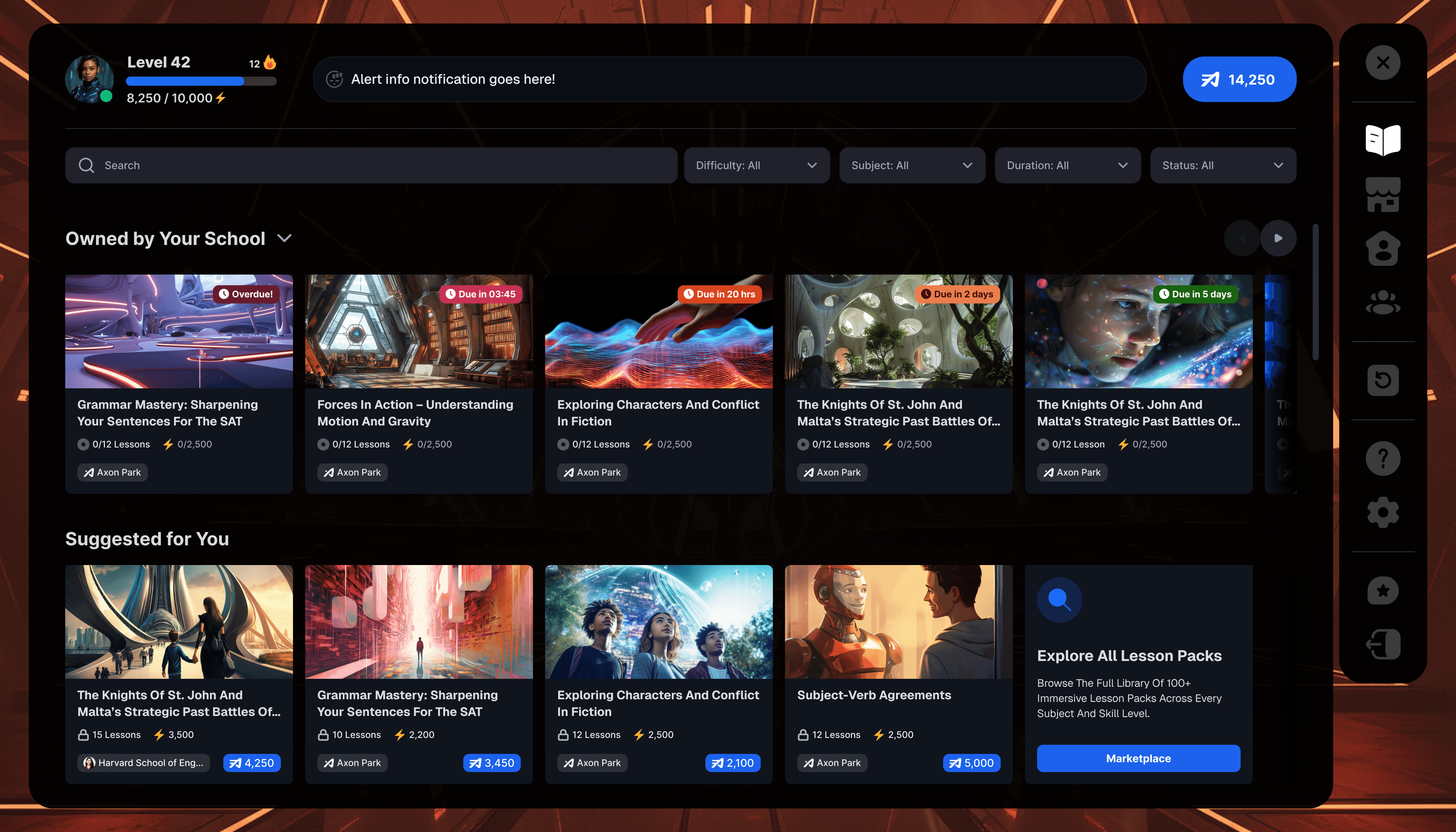
The Lesson Packs
Middle schoolers already know how to navigate a content library. They use Netflix, YouTube, and Spotify. They understand horizontal scroll rows, thumbnail cards, and status badges without needing a tutorial.
So that's exactly the pattern I leaned into. The lesson library in the game uses a familiar row-based layout, with each section serving a clear purpose. Assigned coursework from their school sits at the top with urgency badges, doing the communication work.
Below that, a Suggested for You row surfaces personalized recommendations, with KP values and lesson counts on each card, so students can weigh what's worth their time before they commit. Each card uses a full cinematic thumbnail, rendered environments, dramatic landscapes, and real editorial imagery because, for this age group, the cover absolutely matters. If it doesn't look interesting, they won't click it.
The right-side navigation rail keeps the most-used destinations always one tap away: the marketplace, collectibles, settings, and achievements. The header carries the student's level, XP progress bar, streak, and current Charge balance, so their status is always visible without taking up screen real estate.
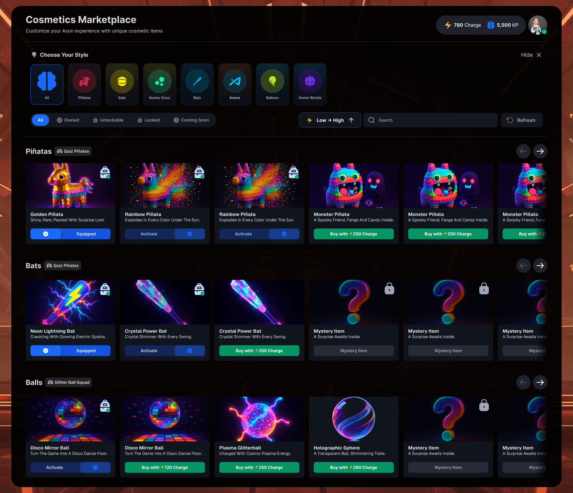
The Collectibles Gallery and Cosmetics Marketplace
Gamification without meaning is just decoration. Gamification tied to real learning progress is motivation.
Every collectible in the gallery was earned through demonstrated subject mastery, organized by domain. A Basic Calculator for completing Mathematics work. A Golden Ratio Compass for Geometry. Items not yet unlocked were shown in locked states with a clear signal of what was needed to unlock them, keeping the progression loop active rather than frustrating.
The Cosmetics Marketplace connected the reward economy directly back to gameplay. Pinatas, Bats, Balls, Balloons: the actual in-game objects used during learning activities. When a student equipped their Golden Piñata for quiz rounds or picked the Neon Lightning Bat for a Fiesta Piñata session, they brought their own identity into the learning moment. These weren't cosmetic in the throwaway sense. They were visual records of effort and time invested.
The AI Companion
The AI companion lives in the bottom corner of the game HUD, one tap away from wherever the student is and whatever they're doing. Mid-activity, between lessons, exploring the world, it doesn't matter. The conversation is always available, and it never makes them feel like they're falling behind for asking.
Students can call it up to ask questions about the lesson they just completed, request a hint when they get stuck on an activity, or take a spontaneous quiz to test themselves on something they want to lock in. The interaction is conversational, not transactional.
Voice mode took it even further. Students can speak their responses aloud, which, for this age group, changes everything about how engaged they feel. The live audio waveform confirms the companion is listening. It's a small detail, but it makes the interaction feel real in a way that typing alone doesn't.
The companion's character model is visible in the 3D world itself, not floating in a separate UI layer but actually present in the environment alongside the student. That was a deliberate design decision. The difference between a chat window and a character standing in the room with you is the difference between a tool and a relationship.
The Outcome
What started as a collection of strong but disconnected pieces became a fully unified, immersive learning ecosystem. One design language, spoken consistently across a marketing website, a multi-role web portal, and a real-time 3D game environment built in Unreal Engine.
Increased student engagement. Students spent significantly more time inside the platform. A clearer reward loop, better navigation, and genuinely playful activity design made sessions stickier and increased return rates.
Improved educator adoption. Teachers who had previously found lesson creation confusing could move through the new wizard flow independently, reducing onboarding friction and the need for ongoing support.
Stronger parent confidence. The dashboard redesign gave parents clear, emotionally readable data on their children's progress, reducing churn driven by uncertainty about whether the platform was actually delivering value.
A scalable design foundation. The design system and brand documentation gave the entire team, including the Unreal Engine 3D crew, a shared visual language to build from. New worlds, activity types, and subject areas could be added without having to reinvent the design from scratch each time.
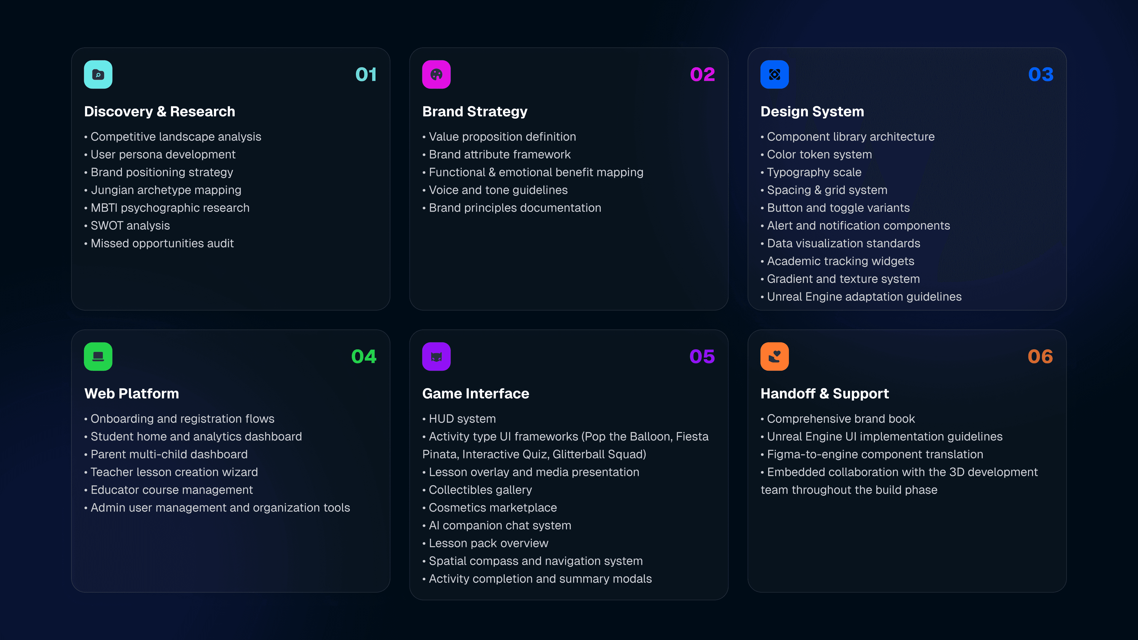
Process Overview
The project moved through a clearly defined arc across multiple workstreams running in parallel.
Discovery and Research: Competitive landscape analysis, user persona development, brand positioning strategy, Jungian archetype mapping, MBTI psychographic research, SWOT analysis, missed opportunities audit.
Brand Strategy: Value proposition definition, brand attribute framework, functional and emotional benefit mapping, voice and tone guidelines, brand principles documentation.
Design System: Component library architecture, color token system, typography scale, spacing and grid system, button and toggle variants, alert and notification components, data visualization standards, academic tracking widgets, gradient and texture system, Unreal Engine adaptation guidelines.
Web Platform Design: Onboarding and registration flows, student home and analytics dashboard, parent multi-child dashboard, teacher lesson creation wizard, educator course management, admin user management, and organization tools.
Game Interface Design: HUD system, four activity type UI frameworks (Pop the Balloon, Fiesta Pinata, Interactive Quiz, Glitterball Squad), lesson overlay and media presentation, collectibles gallery, cosmetics marketplace, AI companion chat system, lesson pack overview, spatial compass and navigation system, activity completion and summary modals.
Handoff and Implementation Support: Comprehensive brand book, Unreal Engine UI implementation guidelines, Figma-to-engine component translation, embedded collaboration with the 3D development team throughout the build phase.