Financial Closing Platform

Lead Product Designer, Design System Architect

Switzerland

When I joined the team, the financial close platform was in its early stages, it was functional but inconsistent. There was no design system in place, and much of the user experience was shaped by engineering-led decisions rather than a user-centered design approach.
My goal was to lead a comprehensive UX/UI transformation of the product without delaying development. The stakes were high: this software was essential for finance teams to manage critical, time-sensitive workflows during their month-end, quarter-end, and year-end closing cycles. The redesign had to be efficient, intuitive, and scalable.
I started by outlining the platform's essential features and assessing user challenges within the financial close process. This involved:
- Reviewing workflows across various user roles, including accountants, controllers, and administrators.
- Identifying issues with checklist usage, task ownership, and approval processes.
- Pinpointing instances where outdated tools, such as spreadsheets and emails, were still being utilized.
From the beginning, I prioritized clarity and progress for both the end users and the development team.

Building a Design System from Zero
Since there was no existing design system, I decided to implement one that would speed up both design and development processes. After evaluating various options, I chose Flowbite, a TailwindCSS-based component library, for three main reasons:
1. Speed: The pre-built components allowed for rapid prototyping without compromising on quality.
2. Scalability: The use of tokens and a structured approach enabled easy adaptations for future themes.
3. Compatibility: Flowbite integrates seamlessly with the platform's Angular frontend.
Rather than reinventing UI from scratch, I spent time customizing Flowbite’s components to align with the brand’s tone and user needs. This allowed me to focus on what mattered most: improving workflows and reducing friction.

Designing for Real-World Financial Workflows
Kanban-style Financial Closing Board
The financial closing process was redesigned using a kanban-style board that reflects how finance teams actually think and work. I designed the board to:
- Display Financial Line Items (FLIs) in trackable stages
- Enable drag-and-drop transitions
- Show progress indicators, blockers, and ownership status
This visual structure made it significantly easier for teams to collaborate and meet deadlines under pressure.
.png)
Modular Checklists with Ownership and Approvals
I introduced a new checklist system that supported recurring closes (monthly, quarterly) and helped ensure audit readiness. Key features included:
- Owner and reviewer assignment
- Sign-off workflows
- Inline comments and attachments
- Task automation and smart status tags
The result was a clear, interactive, and transparent process for closing books.
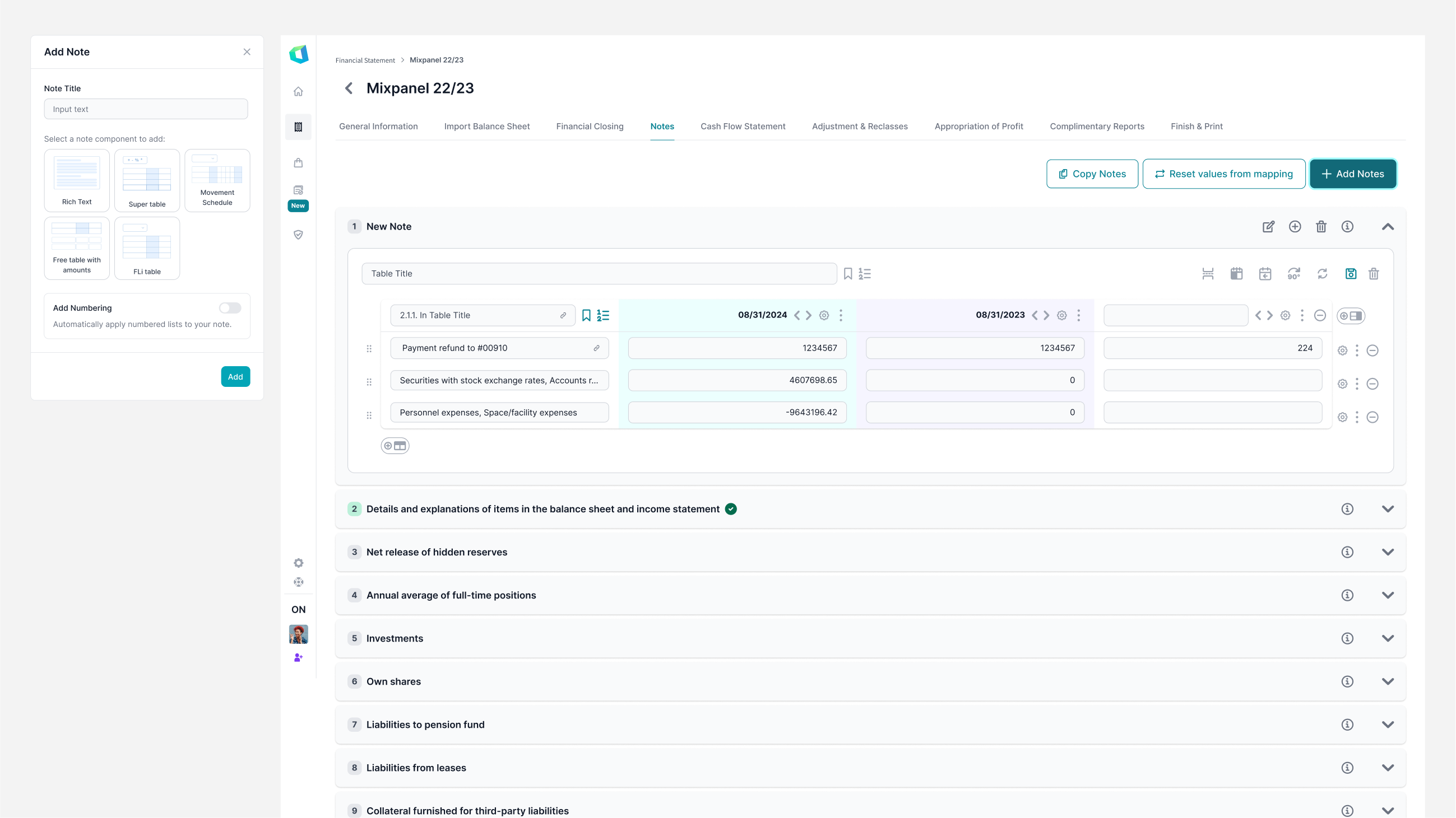
Designing the Notes Module: Turning Complexity into Clarity
One of the most complex aspects of the platform was the Notes module. This space required users to compile supporting financial disclosures, add narrative context, and reconcile key figures across multiple tables and reporting periods. The module was not just for data entry; it needed to support rich text, nested tables, movement schedules, calculated fields, and freeform layouts.
It quickly became evident that most users were accustomed to performing this work in Excel. They relied heavily on familiar actions, such as copying rows, writing inline calculations, and freely organizing content. My challenge was to translate that flexibility into a structured interface without overwhelming users who lacked technical training.
Key UX Goals:
- Mimic the familiarity of spreadsheets while introducing safeguards and structure.
- Allow for component-based note creation with options like Rich Text, Super Tables, linked tables, and Movement Schedules.
- Enable fluid transitions between data entry and formatting, allowing users to build disclosures section by section.
- Maintain a clean and non-threatening design, even as functionality expanded.
I designed a modular system where users could:
- Add a note and select from predefined table components.
- Drag and drop or reorder sections.
- Toggle auto-numbering for compliance-ready formatting.
- Inject calculated values, often derived from other parts of the platform or imported balance sheets.
To support cross-team usage, I also introduced features such as:
- “Copy Notes” to duplicate structures across financial statements.
- “Reset from mapping” to auto-fill tables with linked data.
- Contextual indicators to show which sections were completed or still pending.
By aligning the Notes experience closely with spreadsheet behavior while presenting it in a consistent, UI-driven interface, I was able to reduce user friction while still implementing structure, validation, and auditability. Finance teams could now collaborate and compile disclosures more efficiently, without the need to switch between Excel and the platform.
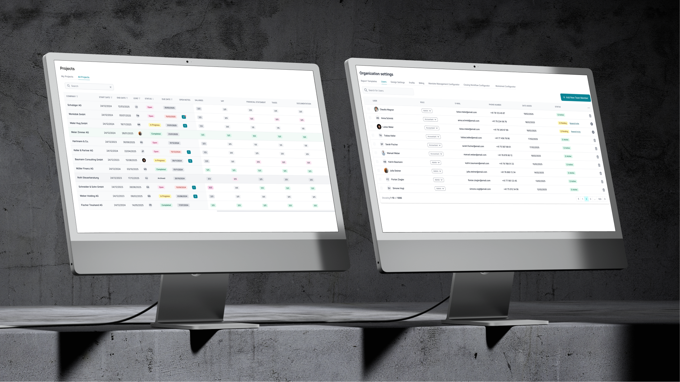
Designing for Table-Heavy Interfaces
The financial platform I worked on relied heavily on data tables to drive core user experiences. From project overviews and user permissions to closing checklists and tax compliance statuses, nearly every central module used tables to present dense, actionable information.
While tables are powerful, they can quickly become overwhelming, especially in a platform designed for finance professionals managing dozens of clients and hundreds of documents.
My Design Goals:
- Make data-heavy views feel accessible and scannable
- Keep interactions consistent across different table types.
- Support quick actions (like invites, edits, and status changes) without breaking flo.w
- Surface what matters most—deadlines, missing items, or status blockers
To manage the number of tables across the platform, I created a flexible table system and layered custom tokens for spacing, color, and interactive states. This ensured that:
- Tables stayed consistent in look and feel, regardless of module.
- Developers could reuse components without re-coding
- We could handle thousands of rows without sacrificing UX clarity.
Small design decisions cell padding, chip contrast, action affordances, make or break the experience in a platform where the table is the primary interface. I focused on making data feel light, navigable, and always user-first.